You’ve spent millions of rupiah on Facebook, Instagram, or Google Ads. Every day you see metrics on your ad dashboard: high CTR, thousands of clicks.
But a problem arises when you look at your final sales report: Very few are buying or filling out forms (leads).
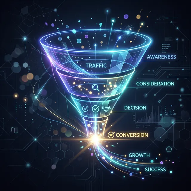
If this scenario sounds familiar, the problem isn’t the ads; it’s your Landing Page. A low Conversion Rate destroys your ad ROI.
Here are 7 quick ways you can implement this week to explode your landing page conversions:
1. Create a Headline That Answers “What’s in it for me?”
Most visitors take only 3-5 seconds to decide whether to stay on a landing page or close it. Don’t use generic headlines like “Best Management App”. Use benefit-driven headlines like: “Cut Your Data Entry Time from 3 Hours to 5 Minutes”.
2. One Page, One Call to Action (CTA)
The biggest fatal mistake is asking visitors to do too many things. Don’t put “Buy Now,” “View Blog,” “Follow Our Instagram,” and “Subscribe to Newsletter” buttons on the same page! Remove all external navigation. All CTA buttons should lead to only one primary goal (e.g., Checkout or Book a Consultation).
3. Add Authentic Social Proof
People don’t easily believe your claims, but they trust others who have already tried it. Place the following elements prominently:
- Testimonials (complete with real photos and names).
- Client company logos (if B2B).
- Ratings/Stars (e.g., “Rated 4.9/5 by 200+ users”).
- Real-time sales notifications (optional, but often effective).
4. Loading Speed Under 3 Seconds
Smartphone visitors mostly use cellular connections. If your page takes 6 seconds to open (usually because image sizes are too large or scripts are piling up), more than 50% of them will click “Back” (bouncing). Optimize images into modern WebP formats and minimize unnecessary code.
5. Remove Friction on Forms
If the goal of your landing page is to collect leads, keep your form fields as small as possible. Do you really need their Last Name, Occupation, and Home Address in the first step? If not, just ask for Name and WhatsApp Number. The less they have to type, the higher the chance they’ll hit the submit button.
6. Provide a Constantly Visible CTA (Sticky Floating Button)
Especially on mobile versions, don’t let visitors scroll too far reading product details and then get confused looking for the buy button. Add a floating CTA button at the bottom of the screen so anyone can take action at any time.
7. Use High-Contrast Button Colors
The human eye is very sensitive to color contrast (visual isolation). If your landing page is dominantly blue, don’t make the CTA button light blue. Use a striking color like Orange or bright Green that immediately “screams” at the visitor’s eyes to be clicked.
Need Help with Optimization?
Increasing conversions (Conversion Rate Optimization/CRO) is a blend of design art and user psychology science. The digitalsitepro team are experts in designing High-Conversion Landing Pages that work in harmony with your ad campaigns. Consult about your landing page today!